


A Closer Look: Traveling the Amtrak Way
CommentsMarch 31, 2014
In the days when dozens of major railroads were vying with one another to carry people and freight, branding and visual identity were important in setting a company apart in the public mind. Railroads branded themselves in a variety of ways, such as creating standard station designs, color schemes, uniforms and logos. In many cases, this visual identity drew upon the history and culture of the region served by the railroad.
The Atchison, Topeka and Santa Fe Railway, popularly known as the “Santa Fe,” was particularly adept at expropriating elements of Southwestern landscape, American Indian cultures and Spanish Colonial history in crafting its corporate identity. By the early 20th century, depots large and small took on a Spanish flair with stuccoed walls and red tile roofs, while patterns from Navajo rugs and Mimbres pottery appeared in advertising artwork and train décor. For many Americans, these designs evoked a taste of the exotic and provided a glimpse into a little known region.
Some of these design elements carried over to Amtrak, which upon assuming operation of most of the nation’s intercity passenger rail services in May, 1971, had the complex task of figuring out how to merge them into one system. Vestiges of the predecessor railroads lived on in those early years while Amtrak strove to define and standardize its own identity.
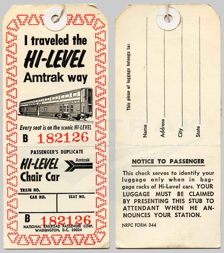
With a cursory glance, the Amtrak baggage tag above appears to show a bi-level Superliner car, but looking closely, you notice that the side of the car says “Santa Fe.” Part of Amtrak’s early fleet included stainless steel Hi-Levels ordered by the Santa Fe for use on El Capitan (Chicago-Los Angeles). These popular cars would later heavily influence the design of the Superliners.
While Amtrak used the cars, it printed baggage tags declaring “I traveled the Hi-Level Amtrak way.” The red border is reminiscent of American Indian motifs. Amtrak followed in the Santa Fe’s footsteps by incorporating similar designs into posters advertising Southwestern travel; upholstery fabric used in the Superliner cars; and even on a menu cover from the late 1990s when Amtrak wanted to give each long-distance train its own regional identity, including specialized cuisine. But rather than appeal to a sense of the exotic as the Santa Fe had done a century earlier, these efforts seem more like attempts at creating romantic imagery that would tie Amtrak to passenger railroading’s rich traditions.
